


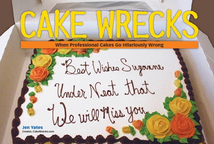
Like Our New Look?
Hmm, something seems a little different here on Cake Wrecks today, doesn't it?
:D
Yep, behold the glory of our brand new site design! Thanks for the many lovely comments so far; I do hope you'll all find it more streamlined and purty-like.
Shout-out time: many MANY thanks to Awesome Aric (yes, I think that's how I shall refer to him from now on) of Tiki Kitchen Design. Aric has been working with me and John for weeks now, and for every "hey, what if we tried THIS?" he gave us multiple options and somehow managed to mask his desire to throttle us with unbridled patience and enthusiasm. Those of you familiar with web design know just how difficult it is to design a customized site in Blogger, so the fact that Aric was willing to try - and had the skills to write code from the ground up when necessary - has been a godsend. We'll be continuing to tweak some of the links and pages this week, but in the meantime y'all be sure to thank Aric in true CW fashion, k?
 And, Aric? We mean that. Truly. ;)
Update: It seems we have all the bugs worked out now but we're hoping you guys can help us out by telling us about any problems you encounter. Let us know okay?
 Jen
Jen


Reader Comments (316)
Some of the background blue for the middle of the page isn't lining up with itself properly for me as seen here: http://tinypic.com/r/2yybda8/3
Or with red lines: http://tinypic.com/r/149rq6a/3
Ooooh. Pretty! I like it, it's lovely.
And I'm running Chrome on Windows.
(Although I wish I were running Safari on Mac. Someday.)
i can see it, and i've tried on both safari and firefox and i'm a mac user -- looks great!
Oh, running Firefox 3.5.2 - Win XP. Little bit of helpful information.
Mac girl here; Firefox. Perfect! Great job!
It's running great for Chrome on windows! Looks wonderful!
Works on OSX 10.4.11 with Firefox 3.5.2. With Safari 3.2.1 on the same system it also works but is very slow to load.
Love it, Jen! Safari, Mac, guess you got all the bugs worked out.
Love the new look! (Just for the record, I'm viewing with Windows/IE.) A great big 'thak you' to Arik for the remodel and also to Jen, Jon, Anne-Marie and everyone else who works so hard to bring Cake Wrecks to us.
Love it, congratulations!
I like the new layout. However, I have the same somewhat minor issue with it as I did with the older one. I dislike having to scroll down past the comments to find the "older posts" button.
Ditto Debbi. Mac and Firefox are good.
Another Debbie!
Love the new look, Jen!!
Looks great! Windows Vista, Firefox 3.0.13
Wow, this new layout is pretty swanky! It's nice to see the blog finally all dolled up and looking as good as the wrecks it holds do not. :p
Windows XP, Service Pack 3; Mozilla Firefox 3.5.2.--all good!
New look is great, guys! So much more user friendly than the last one! Keep it up!
I have Windows XP and am running it with Firefox and it looks great! Woohoo!!!
haha, love the new look! everything came up fine i'm a mac, maybe it has been fixed as i see the comments. THAK YOU ARIC!!
Looking good on Firefox Mac OSX!
Looks awesome here - vista/firefox
Love the new look! I'm using Chrome and I'm seeing everything just fine!
I like the new look AND love the carrot jockey's!
I love the new look! The baby carrot jockies are a great touch lol
Thank you Aric!
LOVE the new look. Very modern and upbeat. Thanks for all the great and not so great cake postings. I am a decorator so I can really appreciate what is posted.
Looks fantastic! Streamlined and clean and organized. :)
Mac user w/ Firefox here, and not a problem in sight!
I'm also using Firefox and it's fine.
Love the naked baby carrot jockeys! They look like they're using their carrots as floaters in the pool blue background :-)
Loving the new look!
JOHN
I like the babies on carrots.
Hi, long time lurker (and fan!) first time commenter. I love the new look. I can see the site just fine, but horror of horrors, I cannot see the images in the posts! No cake pictures, wah! I'm sure it'll be fixed soon, so I'm not hyperventilating yet...yet.
I'm running firefox on vista, btw, and I've tried refreshing the page several times. I'm about to open up IE to see if it does the same thing.
Thanks for all your hard work CW team, I'm not discouraged. Much love.
Looks fine in Firefox on Ubuntu. Just in case you were wondering...
I'm mainly seeing ads, it's quite offputting. There's an ad at the top instead of a blog header!
Oh I simply adore the color scheme. I love blue and orange, and yellow and purple. Simply marvelous.
My only suggestion is that white text box. White is such a plain, boring color and it's very hard on the eyes in contrast with the dark blue of the rest of the page. Maybe a light orange? Something like #ffc975 and then the main font could be a navy, or #00038d or something.
I'm a graphic design student and if I had worked with Blogger before I would have been more than happy to design the site for free.
Love the new look! Easier to see comments and all... Keep up the great work! :o)
DK
http://uberfoodnoob.blogspot.com/
It's working wonderfully in Opera on my Mac!
Awesome!!!
Love those cherubic baby carrot riders.
All looks good on MacOSX/Firefox
Well done! I like your new look.
I use firefox 3.0.1 on a linux system and I don't have any problems.
Love the carrot jockeys! *G* Using Firefox on XP and it all looks fabulous, dahlings.
UM, well, I see I'm in the minority here, but I don't care for the new look. It's harder on the eyes. The font seems smaller and less easy to red, so I'm staring at the words rather than cake pix. And the cake pix, now surrounded by white instead of that nice blue which drew your eye IN to the pix, well, the white frame is jarring and to me makes the pix look smaller. Sorry to be a grump. It's just more work to look at it.
Looks great! I'll miss the links to other entries in the month though since I'll have to go back through my feed for each new post when I have a bunch to catch up on. I love having a 'recent posts' section or 'next' and 'previous' on a blog.
LOVE the new look!
Beauteous! Google Chrome renders it just fine. :)
Looks Spiffy! Love it!
Awesome new look!
It looks great on Firefox!
Just chiming in that it looks great, haven't had a bit of problem with it displaying correctly. I'm running OS X (Snow Leopard) with Firefox (and AdBlock Plus so I don't see any ads).
Nicely done! Thanks for letting this hobby take over your life! :D
Schmancy. Very nice.
I personally preferred the wider middle column (Firefox 3.5.2 on Vista Home Premium 32 SP2), but this is nice. No major objections, just the minor personal thing about the size of the middle column. :)
It looks glorious on google chrome. Love the carrot jockeys.
Looks great and is working awesome for me! Thak You Very Much ; )
I love it!!!
I have Windows Vista, running IE8 and everything looks just great! I even managed a little rhyme...lol =)