


Like Our New Look?
Hmm, something seems a little different here on Cake Wrecks today, doesn't it?
:D
Yep, behold the glory of our brand new site design! Thanks for the many lovely comments so far; I do hope you'll all find it more streamlined and purty-like.
Shout-out time: many MANY thanks to Awesome Aric (yes, I think that's how I shall refer to him from now on) of Tiki Kitchen Design. Aric has been working with me and John for weeks now, and for every "hey, what if we tried THIS?" he gave us multiple options and somehow managed to mask his desire to throttle us with unbridled patience and enthusiasm. Those of you familiar with web design know just how difficult it is to design a customized site in Blogger, so the fact that Aric was willing to try - and had the skills to write code from the ground up when necessary - has been a godsend. We'll be continuing to tweak some of the links and pages this week, but in the meantime y'all be sure to thank Aric in true CW fashion, k?
 And, Aric? We mean that. Truly. ;)
Update: It seems we have all the bugs worked out now but we're hoping you guys can help us out by telling us about any problems you encounter. Let us know okay?
 Jen
Jen


Reader Comments (316)
Love it! Aric, ya did good. But I'd come here if it were plain old vanilla (icing that is), cause, Jen you're just that funny!
LOVE it! Thanks for making CW more reader friendly. Great job!
ps. Seeing the babies riding on carrots made my day.
I'm on WindowsVistawith firefox and I can see it fine. I like it but I kinda miss the simplisity of the old cake wreks (I really do like it though)
The site looks great! I had no problems using Firefox on Vista. I checked it out on my phone, a Palm Centro using Blazer, and the banner didn't load properly, but to be honest most websites don't translate properly so I usually just disable style sheets.
I like it!
I'm on Firefox, on Linux. The new look works fine for me.
love it!
Looking good!! Loving the Baby Carrot Jockeys up the top!! :)
I'm using vista & Google Chrome as my browser, and it's working fine! :)
Again, very nicely done :)
I much prefer the older layout. But I'm a well known reactionary style curmudgeon.
Ruby
Unfortunately, I can't see it as much as I would like, because it causes Safari on my Mac OS X to freeze up. I have to open an alternate browser (Firefox) to check the site, and I just don't get around to doing that anywhere near as much as I used to check the site when I would read it on Safari. Sorry.
WV: cytes: I can't see the CakeWreck cyte(s) as much as I used to.
Lisa
I'm running Firefox on windows Vusta and it's working great!
I like it!
But can you substitute the font of the post content (in Arial) with something else? It looks a little hard to read. And I'd have chosen a colour other than blue, but overall it's not too bad. Yum!
Windows Vista here, Firefox 3.5.2 - perfect!! And yup, very purty, well done.
Smiles
Hi, I like the new look, very easy to read. And off course the baby carrot riders are the perfect header :)
P.S I am using Mozilla in Windows, works like a charm...
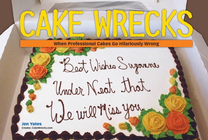
The new site design rocks!!! Love the carrot jockeys at the top! THAK YOU ARIC! Under neat that YOU ROCK!
Thanks, Aric! Looks great!
I love the new look! :)
tina
p.s. it is showing up fine in firefox
no, sorry i dont.
At first I liked it... but after looking at it a second and third time, I gotta say that the new get-up actually makes Cakewrecks harder to look at. The colours aren't quite right and the lighter text box (and font) isn't attractive. I tried to like it, I really did, but the new look isn't as readable as the older one. :( Sorry.
Love the new look! Congrats!!
Anon said
"Please put the explanations or stories of the cakes above the photos! It heightens the effect when you get to the picture."
_________________________
I couldn't disagree more. I love it when I get to see the cake and have the OMG moment and then get to read the even more disturbing explanation. Sometime I don't even know what the pic is supposed to be. The surprise is waaaaay better.
Maybe have the white text boxes a light cream color instead?
Otherwise, awesome.
And take all the comments with a grain of salt. It is your blog after all! Do what you like.
All the best.
Blog fan
Rebecca F.
Nevermind. I see they are a light blue now? Or maybe I'm just getting used to them.
Great job regardless. I'll shut up now. LOL.
NICE
I literally LOL'd at the carrot jockeys.
I'm using Windows XP (probably the last bastion of XP goodness on the planet) -- with Firefox. and it showed up in all it's awesomeness.
WV: Dabla
Aweseome Aric doesn't just dabla in designs - he's a genius!
You even changed the little toolbar tab to a carrot, I LOVE IT!
Can I be a downer and say I'm disappointed? It looks pretty close to what it used to look like...except with MORE ads instead of no ads. Content is still fabulous though!
i haven't been here in awhile..and the awesome webdesign was a surprise! :D
oh man! the new page is so great! everything looks fantastic and it seems that I can navigate to all the blogs easier! plus, I spent like a whole hour going through old blogs and found some I hadn't seen before. This is too awesome!
I'm fine on Safari on Mac OS X. Looks great!
Hooray! The slighty background is about 10,000 times easier on the eyes than that stark white white. Whew. Thanks. Now if you take the font size up just a smidge, it'll be as clear as it was before. :-)
I'm a web designer and I think the changes are wonderful. :)
I'm on Windows Vista, using firefox and I can see the layout without any bugs! I like it a lot! It's very clean!
I'm using firefox on a Mac OS X and it's working fine for me.
i love it. :)
Oooh, looks lovely!
I LOVE that the icon for this website in my bookmarks toolbar is no longer the orange Blogger "B", but is now a frosting carrot. WIN.
I sorta like the new layout but i miss the day/month jump area that was on the right. I can't make the time to visit every day and i liked being able to jump back to the last date i was looking at and move forward.
Hey all,
Thanks for the input and the help. I think we have all the bugs worked out now but please let us know if you find any.
A couple of issues:
The ads. We had 13, I cut it down to 4 not including our book and zazzle. I have to be honest, the ads have to stay. We now have three people full time, a web designer and hosting on an outside source. If it makes you feel any better, Cute Overload has like 20 and Fail Blog is a mess with them.
The white middle column. Honestly, it's just easier to read. We may tweak it to make it less stark but overall, it's getting good reviews. Probably why most books aren't printed with white lettering on a black background.
The dated links on the right side. Whoops! It's back. Sorry about that.
The load time. It's blogger. We are now listed as "very slow" on Alexa but we're doing everything we can to change that.
Thanks all and Wreck On!
john
P.S. to the anonymous poster who's angry comment I didn't post: please feel free to e-mail us directly so that we can take whatever picture you are angry about down. Thanks, j
Alright, a little late on this, so post only if you want to, but the new design looks great! The naked mohawk baby carrot jockeys flying across the top banner is especially terrific. Nice job, Awesome Aric!
~kate
I love it--super cool!
I don't care for the white background around the photos. It hurts my eyes and makes the wrecks look less spectacular.
I have to say, I don't like the new look at all. It's just... big and all over the place and the colors aren't easy on my eyes. The old look was nice.
Kudos to Aric for all his hard work.. my husband was running from me in terror last week when I had to change some html things on blogger!
My only complaint(which I am stating in case this comes up as an issue for change, not because I feel that the world should do everything my way,) is the white background on the posts.
My "old" twenty-something eyes read better when the background is darker and the lettering lighter; plus, I think it helps make your pictures stand out better.
That's all! Congrats on the face-lift!
I am using Firefox 5.0 on a PC with Vista. Works on my end. I love that my RSS feed icon is a carrot LOL
Hello, Can't see the header - using Windows on PC. Maybe my company is blocking the mohawk baby image.
Older design easier on the eye. eg lime green comment boxes take away from the garishness of the cakes.
Thak you John, Jen Aric! Enjoy Dragon*Con and the book launch.
The new look is much, MUCH improved. The banner ad on the top of the page is a major eyesore, though. But otherwise, it's a cleaner, easier on the eyes look. Kudos!
Looks great on my laptop with Win XP and Firefox... not so much on my Blackberry which I often use to check Cake Wrecks on the go...
It's absolutely beautiful here in Kubuntu and Firefox-land! =D
Ur welkom. =D
The answer to your title question is, "Ooh. Yes, I do."
And I actually said that out loud when I clicked over to the site from Google Reader. Just so you know. :)
I love the new look, but can I have some sprinkles on it too? XD