


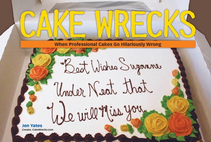
Like Our New Look?
Hmm, something seems a little different here on Cake Wrecks today, doesn't it?
:D
Yep, behold the glory of our brand new site design! Thanks for the many lovely comments so far; I do hope you'll all find it more streamlined and purty-like.
Shout-out time: many MANY thanks to Awesome Aric (yes, I think that's how I shall refer to him from now on) of Tiki Kitchen Design. Aric has been working with me and John for weeks now, and for every "hey, what if we tried THIS?" he gave us multiple options and somehow managed to mask his desire to throttle us with unbridled patience and enthusiasm. Those of you familiar with web design know just how difficult it is to design a customized site in Blogger, so the fact that Aric was willing to try - and had the skills to write code from the ground up when necessary - has been a godsend. We'll be continuing to tweak some of the links and pages this week, but in the meantime y'all be sure to thank Aric in true CW fashion, k?
 And, Aric? We mean that. Truly. ;)
Update: It seems we have all the bugs worked out now but we're hoping you guys can help us out by telling us about any problems you encounter. Let us know okay?
 Jen
Jen


Reader Comments (316)
I can see the new formatting, but the header doesn't show up. I see this at the top:#sidebar-wrapper form#cse-search-box {margin-bottom: -10px;} #sidebar-wrapper form#cse-search-box input.gsc-input { margin: 0 5px 0 0 !important; width: 148px !important;} #comments dd, #comments dt, #comments dl { display: block; position: relative; width: 500px; } #comments dd.comment-footer { width: 502px; } .post-body {margin-top: 1px !important; border-top: 1px solid #135; } .post-header h3 { padding-bottom: 4px; }
I'm using Firefox 3.something on Vista/Windows/PC
Just wanted to add that I'm seeing a few lines of code at the top of the page, and I'm using Firefox with Ubuntu Linux. But other than that (which is a small ignorable thing) it looks fabulous.
Looking good.
Running IE8 on Vista... have a biiiiig block of html/code showing at the top of the page.
I'm using Firefox on OSX and while I can see the layout perfectly (it looks great), there is a small, two-line strip of html at the very top of the page
I see a block of XML code above the header, but otherwise it seems okay. I'm on Win XP 2002 SP2, running IE 6.0. All the best!
Wow.
Looks good! only glitch I see is this text up at the top:
#sidebar-wrapper form#cse-search-box {margin-bottom: -10px;} #sidebar-wrapper form#cse-search-box input.gsc-input { margin: 0 5px 0 0 !important; width: 148px !important;} #comments dd, #comments dt, #comments dl { display: block; position: relative; width: 500px; } #comments dd.comment-footer { width: 502px; } .post-body {margin-top: 1px !important; border-top: 1px solid #135; } .post-header h3 { padding-bottom: 4px; }
I'm running Vista and browsing through latest Firefox.
However, I do NOT see that code when I view your blog through Chrome browser.
Looks great!
(using Safari on Mac OSX)
I'm on a pc with Firefox 3.0.13, and everything looks great!
Looks great Jen! I love the new side bar with the tab options. Looking forward to your book signing in Portland!
I like it and can see it just fine on PC with an older version of ie. Love the carrot jockeys! I wish the post comment link was higher, though.
Thanks Aric! Very purty. And working perfectly on my pc with firefox.
-Lyn
I can see the new layout, but I'm also getting a mess of html on the top of the page for both IE and Firefox on Windows Vista.
It looks like http://i27.tinypic.com/aufw60.png" rel="nofollow">this on IE, and http://i28.tinypic.com/29wuwbq.png" rel="nofollow">this on Firefox.
Hope this helps!
Nice new digs!
Congrats all around.
(looks great with Firefox...of course!)
I love it!
Great new look - I especially love the carrot-riding babies :)
I normally resist change violently (kicking and screaming), but I have to say, I do like this better. The page loads much faster and the look is much less cluttered. Good job!
Google Chrome on my PC and it's looking GREAT! No refresh needed at my end ...
Looks great to me - on Safari/Mac, accessed via Google Reader. Love those little carrot guys. :)
New site looks great! It works just dandy on my work PC (I mean... I don't look at CW at work!) and I don't expect any issues at home. Thanks for the great blog, and I can't wait to visit Powell's and meet you when you stop by Oregon on your tour!
Jen, I love the little carrot symbol- so cute and so hilarious!
Have a Mac, looked at both Safari and Firefox... both look great and both looked identical.
I like it and everything seems to be working
I checked it last night and it looked great, this morning the top header area is all html.
Looks great! I'm on Windows XP with Firefox.
I see a blue starburst-y thing and babies riding carrots, but no header that says "Cake Wrecks" or "Cak Wreks" or even "Cake Wercks". Everything else seems to appear, a few ads, some blogher stuff on the left, etc.
On Firefox on PC with Vista (blech).
I'm using Firefox on a windows system and it works fine for me. It looks fabulous.
I am using a PC running Vista and using Google Chrome and it looks GREAT!!! Love the new look!
I'm using firefox on a pc and it's working just perfectly for me. thak you very much!
I'm on Windows XP, using Firefox, and it looks awesome! Kudos, Aric :)
"p.s. Older Eyes,
We'll move it to the right in it's own light box with black text :)"
Thanks John.. Mom always said that the squeaky wheel gets the grease! :)
It's working on Safari 4.0.3
Looks good to me and I'm on Linux(Ubuntu) and using Firefox. Awesome work!
LOVE the new look!
those carrotbabies make me giggle every time.
no
I like it a lot!
love the new look, jen and john!
thak you! thak you very much, arik!
terry lee
windows/vista (ack!!)
I see it all just fine, and I'm on the latest version of Firefox, on a Mac.
I can see it fine on Windows 7 with Opera 10. Great work!
I can see it just fine & I'm on a PC running Vista viewing it on Firefox
took a few tries, but finally saw something-I'm a PC
I don't usually like change. If it ain't broke and all that.
But, I DO like the look.
The sizing is good. One zoom in and it is the perfect reading width on my blackberry.
Unfortunately, it is loading slower. And intermittently locking up. Either the resolution is higher, or the scripts are doing too much.
I know blackberry is not a high priority browser.
I used to have troubles but it had been much better lately.
I CAN see it and apparently can leave comments.
Yay!
Alex
i really really like it!!!!!! this new comment style is awesome. i have a mac OSX. at first the page didn't show up, but then i refreshed and it did~!
Looks GREAT! (I had no problems viewing it @ 9:30am est when the new post was up) Looking forward to spending many hours at work at the site! My monitor at work does not have good contrast and brightness so the white background around the posts will make it easier to see!
(BTW PC with Firefox 3)
Christine :o)
Love the new look! Can't wait to see more cake wrecks.
I'm running Firefox on Jaunty (netbook version I might add) and it looks beautiful! :D
"how difficult it is to design a customized site in Blogger"
Yeah, I "wrestled" with it last month and pretty much gave up after a week: http://www.wrestlecrapradio.com/
There are similiarites in layout, and you guys did a much better job.
Yours is one of five sites I frequent.
I'm on a Mac 10.5.8, using Firefox and see it just fine. Love the new design! Gorgeous! Aric rocks!
Hey just wanted to make a general comment on your WoW posts. In the game neither the Horde or Alliance are inherently evil except to one another. They both fight a common enemy but as separate factions. It is, however, common knowledge that the Horde are primarily played by more adults than the Alliance because they "look evil". WoW lore would actually define the Alliance as being more evil per their actions and general intolerance of so many other races in the game.
Love the updated look - had to giggle when I saw the babies riding the carrots.
Congrats on your success!