


Like Our New Look?
Hmm, something seems a little different here on Cake Wrecks today, doesn't it?
:D
Yep, behold the glory of our brand new site design! Thanks for the many lovely comments so far; I do hope you'll all find it more streamlined and purty-like.
Shout-out time: many MANY thanks to Awesome Aric (yes, I think that's how I shall refer to him from now on) of Tiki Kitchen Design. Aric has been working with me and John for weeks now, and for every "hey, what if we tried THIS?" he gave us multiple options and somehow managed to mask his desire to throttle us with unbridled patience and enthusiasm. Those of you familiar with web design know just how difficult it is to design a customized site in Blogger, so the fact that Aric was willing to try - and had the skills to write code from the ground up when necessary - has been a godsend. We'll be continuing to tweak some of the links and pages this week, but in the meantime y'all be sure to thank Aric in true CW fashion, k?
 And, Aric? We mean that. Truly. ;)
Update: It seems we have all the bugs worked out now but we're hoping you guys can help us out by telling us about any problems you encounter. Let us know okay?
 Jen
Jen


Reader Comments (316)
Do you think it would be possible to have a link to the original naked carrot jockeys cake in the area where they're featured on the front page? It may be a bit much for noobs to understand.
Long live the Carrot Jockeys! Love the new layout. :)
:( Now I can't view the page on my BlackBerry anymore, since it takes forever to load, then thinks and thinks and thinks and I have to reset my BBerry. bummer.
-Melissa
Saweet design, much nicer!
I love the new look! Great work, Aric!
Love the new look - it's fantastic!
I wish it had the links that change color after you click them. I knew what I had seen already without clicking it before. I had found a little pocket of Wrecks I had missed before "The Change", now I cannot find them. :-(
All that's missing is the sprinkles!
love the new design! i'm on 10.6/safari 4 and it looks great. nice work.
I second the comment about preferring the wider middle column to the new design. Just a preference. And the ads on this version really seem to pop out even more... :/ Sorry. I guess I liked the old version better. I guess it's mostly the prominent ads on the left side and the narrower column of content. Good luck though.
Thak you - that's exactly how my toddler granddaughter says it!
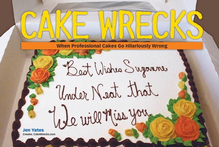
love the new look! also love the moldy strawberries on this appalling cake!! :)
I tried to post before but I don't think it works. Sorry, but I liked the old design better. :/ The ads seem so much more prominent in this version. And I agree with the person who liked the wider center column instead of this narrower one. Those are my two main problems. The rest I guess I'll get used to, but I had to admit I liked the old version better.
I would just like to commend you on properly spelling the word "y'all" in your thanks to Aric. Sadly, I have seen many of my fellow Southerners misspell this word over and over again (and it drives me crazy!). I don't know where y'all are from, but I'm happy to see it spelled properly, whether by a Southerner or a Yankee (bless their hearts). ;o)
Hello! Another problem I'm having a problem. I can't e-mail! See, my e-mail isn't through my computer...I use gmail (and hotmail for my junk-mail and yahoo for my website). All of them are browser based e-mails...so the little Java based thing you have going just doesn't work for people like me (if you have a browser system you need to be able to copy-paste the actual address).
Thought I'd bring that to your attention. I understand that what you have now cuts down on spam, but I'm wondering if the wonderful Aric maybe has a solution to this up his sleave. (By the way...the new design looks great!)
Is it supposed to have a huge verticle line running down the center of the page? If so, it sucks. It's hard to read the text by the line, because they're both white.